 how-to
Warm or Cool Art for Gray Rooms: A Guide
Table of Contents
- Does Warm or Cool Art Fit Gray Rooms?
- Understanding Warm and Cool Color Temperature
- Warm Gray vs Cool Gray Undertones
- What Colors Go With Gray Walls
- How to Warm Up a Gray Living Room With Artwork
- Coordination vs. Contrast: Which Approach Works Best
- Choosing Art for Your Gray Room: Practical Tips
- Frequently Asked Questions
Last Updated: October 21, 2026
Does Warm or Cool Art Fit Gray Rooms?
Gray walls are versatile. They're neutral, calming, and work with almost any décor style.
The question isn't whether warm or cool art works with gray rooms. Both can. The real question is which one matches your space and creates the mood you want.
At Lux Landscape Art, we help customers choose artwork that transforms their rooms.
In this guide, we'll walk you through how to choose between warm and cool artwork for your gray space.
Understanding Warm and Cool Color Temperature
Color temperature describes how warm or cool a color feels. Warm colors include reds, oranges, yellows, and warm browns.
Think of it like light itself. A sunset feels warm. A clear winter sky feels cool.
Warm colors make spaces feel:
- Cozy and intimate
- Energetic and welcoming
- Closer to you (they visually advance)
Cool colors make spaces feel:
- Calm and serene
- Spacious and airy
- Further away (they visually recede)
When you hang artwork in a room, its color temperature affects how the entire space feels. A warm landscape painting will heat up a cool gray room.
This is why the choice matters. Your artwork isn't just decoration. It's an active player in your room's atmosphere.
Warm Gray vs Cool Gray Undertones
Not all grays are created equal. Some grays lean warm. Others lean distinctly cool.
Warm gray contains hints of beige, taupe, or soft brown undertones. It feels comfortable and approachable.
Cool gray contains hints of blue, green, or purple undertones. It feels more modern and sophisticated. Cool gray walls are more challenging because they can feel sterile without the right accents.
The undertone of your gray walls will influence which artwork works best.
Identifying Your Gray's Undertone
Here's how to tell if your gray is warm or cool:
Look at it in different lighting. Natural light, warm lamp light, and cool overhead light will all reveal different undertones. If your gray looks more beige in natural light, it's warm gray. If it stays gray or takes on a blue tint, it's cool gray.
Compare it to white. Place a piece of pure white paper next to your wall. If your gray looks yellowish or peachy next to the white, it's warm. If it looks bluish or greenish, it's cool.
Observe how it changes throughout the day. Warm grays shift with the sun's position. Cool grays stay relatively consistent but may deepen in shadow.
Once you know your gray's undertone, you can choose artwork that either harmonizes with it or intentionally contrasts.
What Colors Go With Gray Walls
Most guides stop at a color wheel. For artwork in a gray room, the more useful question is: which art colors will coordinate with your specific gray, and which will intentionally contrast with it? Use this as a decision guide rather than a generic palette list.
Match art to your gray's undertone
Start with the undertone you identified above, then choose art that shares it for a harmonious look:
- Warm gray (beige, taupe, soft brown undertones): warm art colors such as ochre, terracotta, burnt sienna, cream, warm white, olive, and muted gold. Landscape prints with golden-hour light, autumn foliage, or sandy dunes sit naturally here.
- Cool gray (blue, green, or violet undertones): cool art colors such as slate blue, teal, sage, seafoam, lavender, icy white, and charcoal. Coastal scenes, misty forests, and cool abstract washes reinforce the wall color.
- True or neutral gray: you have the most freedom. Either direction works; choose based on the mood you want rather than the wall.
Contrast on purpose
If you want the art to stand out rather than blend, flip the pairing:
- Warm art on cool gray walls adds energy and draws the eye. A warm sunset landscape against a blue-gray wall becomes an instant focal point.
- Cool art on warm gray walls creates calm and sophistication. A cool abstract piece against greige walls feels gallery-like and restful.
A simple rule of thumb: coordinate when you want the room to feel settled, contrast when you want the artwork to be the star.
Art colors by common gray shade
- Light gray walls: almost any art temperature works. Use warm art to keep the room from feeling washed out, or cool art for an airy, coastal feel.
- Blue-gray walls: warm art (gold, rust, cream) prevents the room from feeling chilly; cool art (navy, teal) creates a monochromatic, serene look.
- Greige walls: warm art harmonizes; cool art adds crisp contrast.
- Charcoal walls: warm art glows against the dark backdrop; cool art can disappear unless it has strong value contrast (light against dark).
A note on frame and mat color
The frame and mat are part of the color decision. A warm wood frame reinforces warm art; a black or silver frame reinforces cool art. A white mat separates art from the wall and lets either temperature read clearly. If you are unsure, a neutral frame and white mat let the artwork's temperature do the talking.
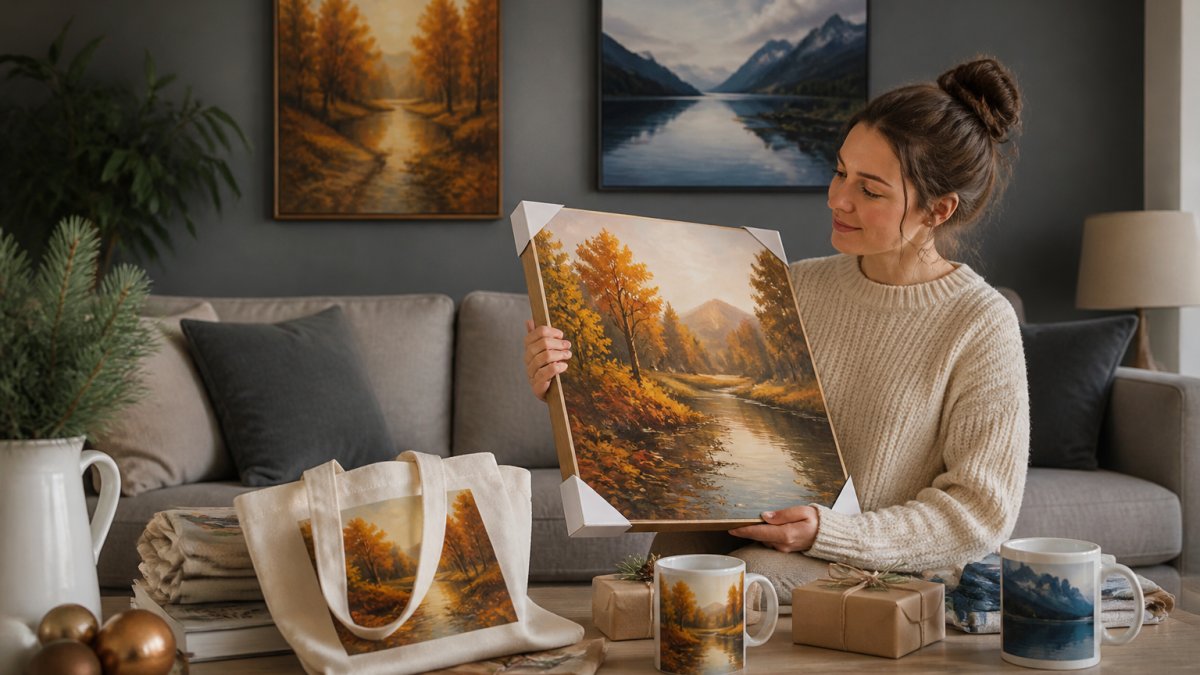
When you are shopping for holiday gifts on a budget, this framework helps you choose small art prints on totes and mugs for warm or cool art gray rooms, ensuring gifts actually coordinate with the recipient's space rather than guessing at a color that may clash.
How to Warm Up a Gray Living Room With Artwork
If your gray room feels too cold or sterile, warm artwork is your fix.
Warm artwork includes:
- Landscape paintings with golden light and earthy tones
- Abstract pieces featuring reds, oranges, and warm yellows
- Scenes with warm sunset lighting
- Prints with cream, beige, or warm white accents
When you add warm art to a cool gray room, you're introducing visual warmth. The room immediately feels more inviting and lived-in.
Where to place warm artwork:
- Above a sofa or seating area (creates a focal point)
- Opposite a window (catches light and reflects it back)
- On a gallery wall with multiple pieces (builds visual interest)
Lux Landscape Art offers landscape prints available on totes and mugs.
You don't need large, expensive pieces to change a room's temperature. Even small warm-toned artwork displayed strategically can shift the entire mood.
Coordination vs. Contrast: Which Approach Works Best
There are two main strategies for pairing artwork with gray walls: coordination and contrast.
Coordination means choosing artwork that echoes your gray's undertone. If you have cool gray walls, you'd hang cool-toned artwork.
Contrast means deliberately choosing artwork that opposes your gray. Warm art on cool gray walls. Cool art on warm gray walls.
Which approach works best depends on your goals:
- Choose coordination if you want: A calm, cohesive room. Visual rest. A sophisticated, subtle aesthetic.
- Choose contrast if you want: A dynamic, energetic space. A focal point that commands attention. Visual excitement.
Both approaches work. The choice is about the mood and atmosphere you're creating.
In practice, many successful rooms use a mix. Coordination creates the foundation. Small contrasting accents add personality.
Lux Landscape Art's curated collection includes both warm and cool pieces. Using our augmented reality technology, you can preview how warm or cool artwork will look in your gray room before you buy.
Choosing Art for Your Gray Room: Practical Tips
Color temperature is only half the decision. Scale, framing, placement, and testing determine whether warm or cool art actually works in your gray room. Here is the practical checklist.
1. Match scale to the wall and furniture
A small print on a large empty gray wall looks lost; an oversized piece over a small console overwhelms it. A common pattern is to size art at roughly two-thirds to three-quarters of the width of the furniture below it. For a sofa, that often means a single large piece or a grouped set spanning most of the sofa's width.
2. Choose frame finish to reinforce temperature
- Warm art: warm wood (oak, walnut), brass, or gold frames reinforce the warmth.
- Cool art: black, silver, or white frames keep the cool feel crisp.
- Neutral frame + white mat: lets either temperature read clearly and is the safest choice if you plan to rearrange art later.
3. Use mat color to control contrast
A white mat creates breathing room between art and gray wall and makes the art pop. A colored mat that echoes the art's dominant hue creates a more blended, coordinated look. For charcoal walls, a light mat helps cool art stand out.
4. Group warm and cool pieces intentionally
Gallery walls can mix temperatures, but give them a logic: alternate warm and cool pieces for rhythm, or cluster warm pieces together as a focal zone against a cool wall. Keep frame finishes consistent across a grouping so the color temperature, not the frames, does the talking.
5. Test in the actual room and lighting
Color shifts under different light. Warm lamp light exaggerates warm art; cool daylight exaggerates cool art. Before committing, hold a sample or use a preview tool in the real space at different times of day. This is where Lux Landscape Art's augmented reality preview helps: see how a warm or cool piece reads against your actual gray wall and furniture before you buy.
6. Start small and layer
If you are unsure, a fine art print on a tote bag or mug is a low-risk way to test a temperature in the room. Place it on a shelf or desk, live with it, then scale up once you know the direction you like. This also makes budget-friendly holiday gifts easy: a warm-toned landscape tote for a cool-gray home, or a cool abstract mug for a warm-gray kitchen.
7. Consider the room's purpose and light
- Low-light rooms: warm art keeps the space from feeling cold.
- Bright, sun-filled rooms: cool art stays calm without feeling sterile.
- Bedrooms: coordinated, lower-contrast art supports rest.
- Living rooms and entryways: contrast pieces create a focal point.

The goal isn't perfection. It's creating a space that feels like home, and these practical steps get you there faster than color theory alone.
Frequently Asked Questions
Does warm or cool art look better in a gray room?
It depends on your gray's undertone and the mood you want to create. Cool gray walls pair naturally with cool-toned art (blues, purples, cool greens), while warm gray walls work beautifully with warm artwork (reds, oranges, warm yellows). However, deliberately choosing contrasting colors, placing warm art in a cool gray room or vice versa, creates visual interest and prevents a flat, monotonous feel. The best choice aligns with your personal style and the atmosphere you're building.
How do you identify whether your gray walls are warm or cool?
Hold a piece of white paper next to your gray wall in natural light. If the gray appears slightly yellow, beige, or taupe beside the white, it has warm undertones. If it looks blue, purple, or greenish, it's cool gray. Another method: compare your gray to a warm beige and a cool blue. Whichever it sits closer to reveals its undertone. Lighting matters too, warm sunlight can shift how gray appears, so check it at different times of day.
Can you mix warm and cool colors in a gray room?
Yes, mixing warm and cool artwork creates balance and visual depth. A cool gray room with primarily cool-toned art can feel cold; adding a warm accent piece (a landscape with golden tones or a print featuring warm reds) softens the space. The key is proportion, use one temperature as your primary palette and the other as accent color. This approach prevents the room from feeling one-dimensional while maintaining harmony.
What's the best way to choose art that works with my gray room's lighting?
Natural light, artificial light, and the room's brightness all affect how artwork appears. In dark rooms or spaces with limited natural light, warm-toned art (yellows, oranges, warm reds) can brighten the atmosphere and make the space feel more inviting. In bright, naturally lit rooms, cooler artwork (blues, cool greens, purples) balances the light without creating glare. Before buying, use augmented reality tools to preview how the piece looks in your actual room lighting, this eliminates guesswork and shows the true color interaction.