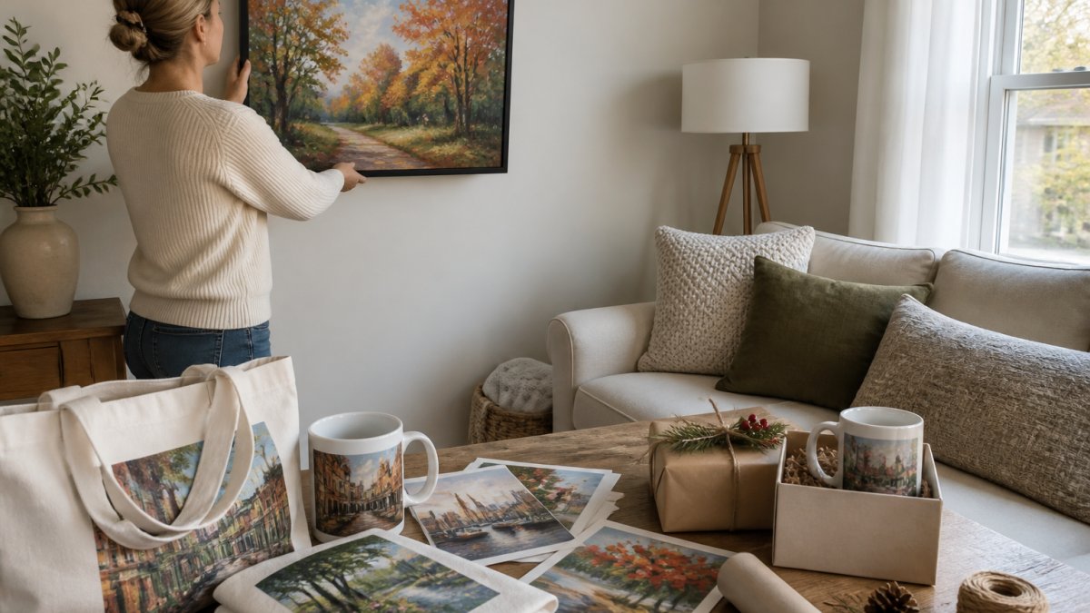
 how-to
Visualize Art in Your Home Before Buying: A 2026 Guide
Table of Contents
- Why Visualizing Art Before You Buy Matters
- Step 1: Measure Your Wall Space and Document Your Room
- Step 2: How to Choose Artwork Size for Your Wall
- Step 3: Use an Art Visualizer App to Preview Placement
- How to Choose Art for Your Living Room
- How to Curate Art for Your Home: Building a Cohesive Collection
- Step 4: Confirm Your Choice and Make a Confident Purchase
- Frequently Asked Questions
Last Updated: October 6, 2026
Why Visualizing Art Before You Buy Matters
Buying art online can feel risky.
This is where the ability to visualize art in your home becomes essential. At Lux Landscape Art, we've built our entire approach around this principle: give customers the confidence to buy by letting them preview artwork in their rooms first.
The stakes are real. Art is personal, and a print that doesn't work in your space sits there as a constant reminder of a bad decision. Visualization tools eliminate that guesswork.
Step 1: Measure Your Wall Space and Document Your Room
Get Accurate Wall Dimensions
Before you can preview any artwork, you need to know your wall. Grab a measuring tape and get three measurements: width, height, and the distance from the floor to where you want the piece centered.
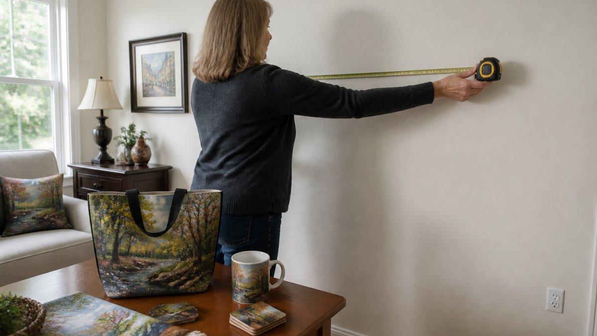
Write these down. Seriously. Don't rely on memory.
Measure twice. If your measurements are off by even a few inches, the preview will mislead you, and a piece that looks perfectly sized on your phone may arrive feeling cramped or too small.
Photograph Your Space for Preview Tools
Next, take a clear photo of your wall. Stand perpendicular to it, use natural light, and avoid harsh shadows or glare.
The photo doesn't need to be professional, just clear enough for an art visualizer app to overlay artwork accurately. Most tools work best with good lighting, a direct angle, and minimal clutter.
Take multiple photos from slightly different angles so you have backup options if one doesn't work well with the tool.
Step 2: How to Choose Artwork Size for Your Wall
The True-to-Scale Rule
Most people get sizing wrong by eyeballing it, judging from a small thumbnail on their phone.
True-to-scale placement means the artwork displays at its actual dimensions in your room photo. When you see a 24x36 inch print overlaid on your wall, you're seeing it at real size, the only way to know if it will actually work.
The best tools let you adjust size and move the piece up, down, left, and right in real time, so you're seeing exactly what you're about to buy.
Single vs. Gallery Wall Sizing
A single piece anchors a wall and needs breathing room, most designers suggest at least 12-18 inches of space on all sides, depending on your wall's dimensions.
A gallery wall is different: multiple pieces work together as a collection, so you can go bolder with sizing because the visual weight is distributed.
A single large landscape print can dominate a living room, while a gallery wall of smaller art prints on totes, mugs, and framed pieces creates a curated feel. The visualization tool helps you decide which suits your room.
Step 3: Use an Art Visualizer App to Preview Placement
Augmented Reality Preview Technology
Augmented reality makes real-time visualization possible. Point your phone at your wall, and the app overlays artwork onto your camera view at actual size, with your actual lighting.
It isn't a perfect simulation, phone screens display light differently than a wall, but it's close enough to catch major mistakes. If a piece looks wrong in AR, it will likely look wrong on your wall.
The best AR tools let you rotate, resize, and reposition artwork instantly, testing multiple options in minutes and building confidence before buying.
Testing Multiple Formats and Finishes
Art comes in different formats, framed prints, canvas, unframed posters, or printed merchandise like tote bags and mugs, and each looks different in your space.
A framed print has a defined boundary, canvas wraps around the edges and feels dimensional, an unframed poster feels lighter and more modern, and printed merchandise like art prints on totes or mugs brings the artwork into functional spaces.
Use your visualization tool to test formats, a landscape as framed print versus canvas, or a smaller print on a mug as a shelf accent. Format affects how the piece integrates into your room.
How to Choose Art for Your Living Room
Color Harmony and Room Lighting
Your living room has a color palette, walls, furniture, flooring, decor. New artwork either harmonizes or contrasts, and both approaches create different moods.
Warm tones feel inviting. Cool tones feel calm. Neutral art works everywhere. Bold colors make a statement.
Room lighting matters more than most people realize: a piece that looks vibrant under gallery lighting might feel muted in softer evening light, while a subtle print might disappear in strong natural light.
Preview your artwork at different times of day if possible, morning, afternoon, and evening light all change how colors appear. That's why visualization matters: you're testing the piece in your actual conditions.
Style Matching and Personal Connection
Does the artwork match your room's style? A minimalist abstract fits a modern space, a detailed landscape suits a traditional living room, and a quirky piece works in eclectic spaces.
But here's the more important question: do you love it?
Style guidelines help, but personal connection matters more. If a piece makes you smile when you look at it, that's the strongest signal, your living room should feel like you, not a magazine spread.
The best approach combines both: artwork that fits your space's style and resonates with you personally. Visualization helps with the first part; only you can judge the second.
How to Curate Art for Your Home: Building a Cohesive Collection
Creating Visual Balance Across Rooms
A cohesive collection doesn't mean every piece matches, it means they share a visual thread: similar color palettes, complementary styles, or a unifying theme.
When building a collection across rooms, think about flow: artwork in your living room should have some visual relationship to pieces in your bedroom or hallway, not identical, but connected.
One approach: choose a limited color palette and stick to it, bringing the same tones from room to room. Another: choose a style theme, like landscape art in different formats and sizes.
The visualization tool helps here too, previewing pieces in different rooms shows which ones feel like they belong together.
Affordable Art Gifts and Merchandise Options
Art doesn't have to be expensive. Printed merchandise like art prints on totes, mugs, and similar items brings original artwork into your home affordably, without the price tag of a framed fine art piece.
These pieces work as functional gifts too: a tote with a favorite landscape becomes a bag you actually want to carry, a mug with abstract art becomes part of your morning routine, and a puzzle becomes an activity.
The advantage is flexibility: test a design in your space before committing to a larger, more expensive piece. If you love a landscape on a mug, you might invest in a framed print of the same artwork later.
Holiday Shopping on a Budget: Unique Gift Ideas That Still Feel Curated
The holiday season is when art gifting gets practical.
Apply the visualization workflow to gifting: photograph the recipient's kitchen counter or entryway bench and visualize art in your home by previewing how a mug or tote design would sit there. You're not guessing at a gift; you're confirming it fits their world.
Budget-friendly doesn't mean low-effort. Two mugs with complementary prints from the same collection feel intentional, and a tote paired with a small framed print of the same artwork creates a mini-collection the recipient can build on.
Mixing Formats Without Losing Cohesion
A cohesive collection can include framed prints, canvas, totes, mugs, and puzzles. The unifying element is the artwork itself, not the format, the same landscape on a hallway print and a kitchen mug still reads as connected.
This is where visualization helps most: preview the framed print on your wall, then the mug on your counter. If the colors and mood carry across both, you've built a collection that works in multiple rooms and formats.
Step 4: Confirm Your Choice and Make a Confident Purchase
Checking Color Accuracy and Preview Limitations
The visualization preview is a guide, not a guarantee. Phone screens display color differently than printed art, and your room's lighting affects how colors appear in person.
Use the preview to catch obvious problems, if a piece looks completely wrong in AR, it probably will be, but expect some color shift between preview and final print. That's normal.
When you're ready to buy, check the product description, look at multiple photos, and read reviews that mention color accuracy for a fuller picture than visualization alone.
Budget, Shipping, and Purchase-Risk Considerations
Visualization reduces uncertainty about how art looks, but not about budget.
For holiday shopping on a budget, printed merchandise like totes, mugs, and puzzles usually ships for less than large framed pieces, making them practical for gift lists with several items.
Returns are the other half of purchase risk. Before you buy, understand the return policy: can you return a piece that doesn't work, and who pays return shipping?
A trusted seller makes this easier. Look for clear return policies, secure checkout, and verified customer feedback.
A Simple Pre-Purchase Checklist
Run through this list before you buy:
- Confirm the wall measurements you used in the preview match the actual wall.
- Check the artwork's true dimensions against the preview scale.
- Review the return window, especially for holiday gifts.
- Compare shipping costs across formats if you're ordering multiple items.
- Verify the seller's checkout is secure and the business has verified feedback.
- For gifts, confirm the recipient's space and style using the same visualization steps.
Visualization tools plus a trustworthy seller give you confidence. You've seen the piece in your space, the business is legitimate, and you understand the return policy and total cost. Now you can buy with real assurance, whether it's a fine art print for your wall or a unique holiday gift like a tote or mug featuring the same artwork.
Frequently Asked Questions
How accurate is augmented reality when showing how artwork will look in my room?
AR preview technology displays artwork at true-to-scale size in your actual space, making it highly accurate for placement and scale decisions. However, lighting conditions in your phone's camera may not perfectly match your room's natural or artificial light. Always take photos in the same lighting where the art will hang. Color accuracy depends on your device's screen calibration, what you see on your phone may shift slightly under different bulbs. Most shoppers find AR previews reliable enough to make confident purchase decisions, especially when combined with measuring your wall space beforehand.
What's the best way to choose artwork size for a wall?
Measure your wall width and height, then use an art visualizer app to preview the actual dimensions in your room before buying. Always photograph your wall and use the app's upload feature to see true-to-scale placement, this removes guesswork and prevents purchasing pieces that feel too small or overwhelmingly large.
Can I return artwork if the colors look different in my home than in the preview?
Return policies vary by seller. Before purchasing, confirm the gallery's return window, whether they cover return shipping, and their restocking process. To minimize color surprises, photograph your wall in the same lighting where art will hang, use the AR preview under those conditions, and check customer reviews mentioning color accuracy. If you're uncertain, start with smaller, more affordable pieces, like art-print merchandise on mugs or tote bags, to test a style before investing in larger originals.
How do I choose art that matches my living room's style and colors?
Start by identifying your room's dominant colors, walls, furniture, and flooring. Choose artwork with colors that either complement or intentionally contrast with those tones. If your room uses warm neutrals, landscapes with earth tones or sunset hues work well. For cooler palettes, abstract or coastal pieces often fit. Consider your room's style (modern, traditional, eclectic) and select art that aligns with it. Use the art visualizer app to preview pieces in your actual space under your room's lighting. This shows whether colors feel cohesive or clash before you commit to a purchase.