 how-to
70/30 Rule in Art: Create Balance With Unequal Proportions
Table of Contents
- What Is the 70/30 Rule in Art?
- The 70/30 Rule in Art Composition
- The 70/30 Color Rule in Art
- 70/30 Rule Examples in Painting
- How to Apply the 70/30 Rule: A Step-by-Step Approach
- The 60/30/10 Rule in Art and When to Break the 70/30
- Putting the 70/30 Rule Into Practice: From Paintings to Printed Art
- Frequently Asked Questions
Last Updated: October 14, 2026
What Is the 70/30 Rule in Art?
The 70/30 rule in art is a composition principle that uses unequal proportions to create visual balance and interest.
This principle works beautifully across all mediums, from paintings to printed merchandise like tote bags and mugs. The rule isn't rigid. It's a guide that helps you think intentionally about how elements occupy your composition and work together.
The 70/30 rule solves a common design problem: how do you create visual interest without chaos? Equal divisions feel static. The 70/30 split creates movement and guides the viewer's eye naturally through your work.
The 70/30 Rule in Art Composition
Composition is how you arrange visual elements within your frame. The 70/30 rule in art composition teaches you to think in terms of dominance and contrast rather than balance through symmetry.
When you apply this principle, you're making a choice: one element takes center stage, and everything else supports it. This creates hierarchy. The viewer knows where to look first, second, and third.
Dominant Element vs. Contrasting Element
Your dominant element is what occupies that 70% of space. It's the star. This could be a large landscape feature, a bold color field, or a prominent figure. The dominant element sets the mood and character of your piece.
Your contrasting element fills the remaining 30%. This is where you add variety. It might be a smaller accent, a different color temperature, a textural shift, or a secondary focal point. The contrast keeps the composition from feeling one-note.
The trick is making these two parts feel connected, not random. They need visual unity even though they're unequal.
Creating Visual Hierarchy and Focal Points
Visual hierarchy is the order in which a viewer's eye moves through your work. Your dominant element should be the primary focal point, the place that draws attention first.
Then create secondary focal points within the 30% contrasting area. These are smaller, quieter, but still intentional. A viewer's eye should have a natural path through your composition.
You control hierarchy through:
- Size (larger elements draw attention first)
- Color intensity (bright or saturated colors pull focus)
- Value contrast (light against dark creates drama)
- Texture and detail (busy areas attract the eye more than smooth ones)
- Placement (center and upper areas command more attention)
The 70/30 rule ensures your hierarchy is clear. One dominant area. Supporting areas that enhance rather than compete.
The 70/30 Color Rule in Art
Color is one of the most powerful tools for applying the 70/30 rule. The color version works slightly differently than spatial composition, but the principle is the same: dominance and contrast.
Dominant Color and Accent Colors
Your dominant color should occupy about 70% of your color palette and visual space. This is your foundation. It sets the overall mood, warm, cool, calm, energetic.
Your accent colors take up the remaining 30%. These are the colors that surprise and delight. They create visual pop and draw the eye to key areas.
If your dominant color is a soft blue-green, your accent might be warm coral or golden yellow. The contrast makes both colors more vibrant and interesting than if you used them equally.
Color Distribution and Visual Weight
Not all colors carry the same visual weight. A small area of bright red feels heavier than a large area of pale gray. This is called color weight.
When you apply the 70/30 color rule, think about weight, not just space. A large area of muted color might balance a smaller area of intense color.
Distribute your dominant color evenly across the composition. Don't cluster it all in one corner. This creates unity. Then place your accent colors strategically, where you want to guide attention.
70/30 Rule Examples in Painting
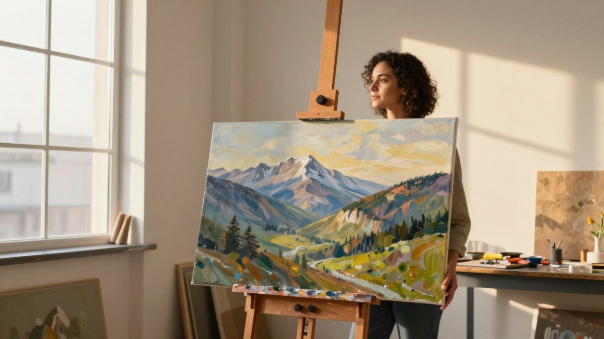
Let's look at how this works in real artwork. Imagine a landscape painting. The sky occupies 70% of the canvas, a soft, expansive blue-gray. The landscape (trees, hills, water) fills the remaining 30%, richer colors, more detail, darker values.
Or consider an abstract piece. One bold color dominates, say, a warm terracotta covering most of the canvas. Smaller shapes in deep teal and cream accent it. The composition feels bold yet balanced.
In portraiture, the face and figure might occupy 70%, while background and negative space take 30%. The figure dominates, but the background prevents it from feeling cramped.
How the 70/30 Rule Works Across Mediums
The 70/30 principle is not limited to painting. It adapts to illustration, photography, and abstract art.
- Illustration: A children's book spread might feature a large character (70%) against a simpler background (30%). The character's expression and action dominate, while the background sets the scene without competing.
- Photography: In a portrait, the subject's face and body might fill 70% of the frame, with the background providing context in the remaining 30%. A landscape photo might have 70% sky and 30% land, or vice versa, depending on the mood.
- Abstract art: A large color field (70%) contrasted with smaller geometric shapes or gestural marks (30%) creates dynamic tension. Think of Mark Rothko's color field paintings, where large expanses of color are subtly contrasted with smaller areas of different hue or value.
- Digital art: A character design might use 70% of one hue for the main body, with 30% accent colors for details like eyes, accessories, or highlights.
Annotated Examples
These examples show that the 70/30 rule is a flexible heuristic, not a fixed formula. The exact proportions can vary, but the principle of dominance and contrast remains.
Applying the Rule to Printed Merchandise
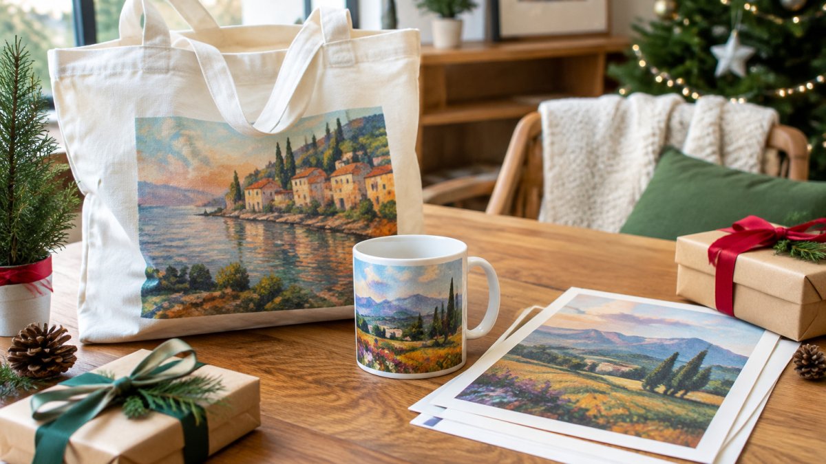
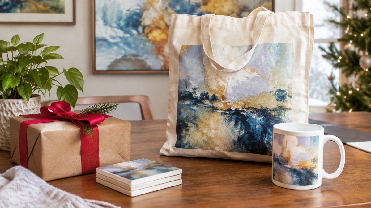
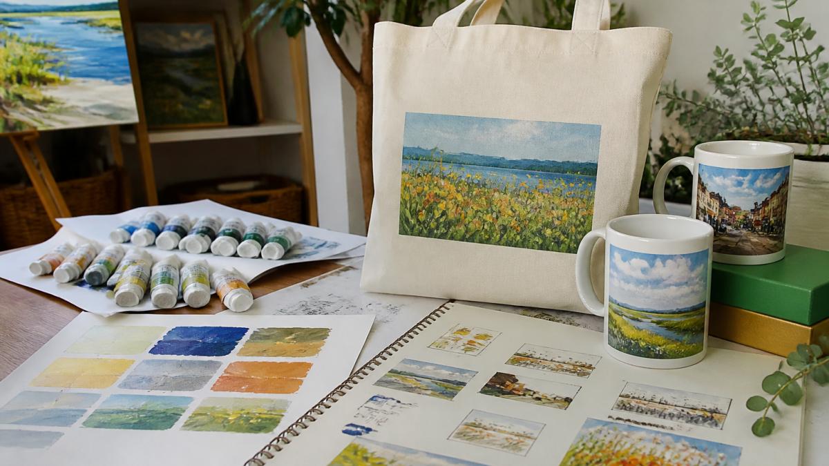
The same principle applies to merchandise. A tote bag design with a large landscape print (70%) and a smaller artist signature or accent element (30%) feels intentional and professional. A mug design might feature a dominant image on one side (70%) and a smaller pattern or text on the other (30%).
When you're shopping for fine art prints on totes, mugs, and similar items, look for designs that use the 70/30 rule. They often feel more curated and thoughtful, perfect for budget-friendly holiday gifts that stand out.
How to Apply the 70/30 Rule: A Step-by-Step Approach
Here's how to use this rule in your own work, with practical methods to estimate and test proportions.
Step 1: Identify your dominant element. Ask yourself: what's the star of this piece?
Step 2: Sketch thumbnail compositions. Draw small, quick sketches (2-3 inches). Experiment with where your dominant element lives.
Step 3: Plan your contrast. What will fill the remaining 30%? A different color? Smaller shapes?
Step 4: Test your proportions. Step back from your work. Squint.
Step 5: Refine and adjust. If something feels off, shift elements slightly. The 70/30 split is flexible.
Testing and Estimating Proportions
You don't need a ruler. Here are three practical methods:
- Grid method: Divide your canvas mentally into four equal sections (like a tic-tac-toe grid). Your dominant element should fill roughly 2.5 to 3 of these sections. Your contrasting element fills the remaining 1 to 1.5 sections.
- Framing method: Hold your hand at arm's length and frame your composition with your thumb and finger. This helps you see proportions at a glance.
- Squint test: Squint at your work until details blur. The dominant area should still read as the main mass. If the contrast area competes, reduce its size or intensity.
Take photos of your work in progress. View them on your phone. Distance and a small screen reveal proportion problems that close-up work hides.
Accessibility and Color-Vision Considerations
When color contrast alone is insufficient, for example, for viewers with color vision deficiency, you can establish dominance through value, shape, texture, or placement. Use a dominant value (light or dark) across 70% of the composition, and reserve the 30% for a contrasting value. Or use a dominant shape (e.g., large organic forms) and contrast with smaller geometric shapes. Texture can also create dominance: a large area of smooth blending versus a smaller area of impasto or pattern. This ensures your composition works for a wider audience.
Common Mistakes When Applying the Rule
Mistake 1: Making it 50/50. The whole point is unequal division.
Mistake 2: Ignoring visual weight. A small bright red shape might outweigh a large muted blue shape. Account for color intensity, not just space.
Mistake 3: Placing everything in the center. Distribute your dominant element across the composition. Let it breathe. This creates unity without monotony.
Mistake 4: Forgetting the contrast. The 30% isn't filler. It's essential. Make it intentional and interesting. It's what prevents your piece from feeling flat.
Mistake 5: Being too rigid. The rule is 70/30, not 73/27. Use it as a guide, not a law.
The 60/30/10 Rule in Art and When to Break the 70/30
Some artists use a three-part formula: 60% dominant color, 30% secondary color, 10% accent color. This adds another layer of sophistication.
The 60/30/10 rule works well when you want more complexity.
When should you break the 70/30 rule entirely? When your artistic vision demands it. Some pieces need symmetry. Some need chaos. The rule is a tool, not a prison.
Break the rule when:
- You're creating a specific mood that requires equal balance
- Your subject matter naturally suggests symmetry
- You're experimenting and learning
- Your intuition tells you something else works better
The strongest artists know the rules well enough to break them intentionally. Learn the 70/30 principle. Master it. Then decide when to set it aside.
Putting the 70/30 Rule Into Practice: From Paintings to Printed Art
The beauty of the 70/30 rule is its versatility. It works for paintings, drawings, photography, and digital art.
Consider a tote bag design.
The same logic applies to mugs.
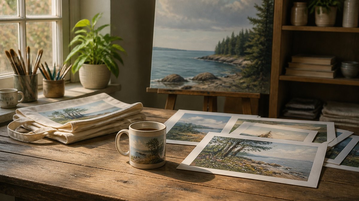
When fine art is printed onto merchandise, this principle can be applied. The artwork remains the star. Supporting design elements enhance without overwhelming.
The 70/30 rule also helps when you're designing a series.
Understanding the 70/30 rule transforms how you approach composition.
Our augmented reality feature lets you preview how artwork, and printed merchandise featuring that art, will look in your space.
The Art Story's guide to composition principles
Interaction Design Foundation's resource on visual hierarchy
The Spruce's article on the rule of thirds and composition
Frequently Asked Questions
What is the 70/30 rule in art?
The 70/30 rule in art is a composition principle where approximately 70% of your artwork features a dominant element, color, or visual idea, while the remaining 30% introduces contrasting or accent elements. This unequal distribution creates visual balance without symmetry, giving the artwork a focal point and dynamic quality. The rule applies to color palettes, subject placement, value (light and dark), and overall composition.
Does the 70/30 rule apply to color, subject matter, or both?
The 70/30 rule works across multiple dimensions of art. You can apply it to color distribution (70% of a dominant color, 30% accents), subject placement (one main focal point occupying most of the composition), value ranges (70% mid-tones, 30% highlights or shadows), and texture or pattern. Many artists use it simultaneously across color and composition to strengthen visual hierarchy and create unity with variety.
How do you apply the 70/30 rule to an art composition?
Start by identifying your dominant visual idea or subject. Allocate approximately 70% of your composition space or visual weight to this element. Use the remaining 30% for contrasting colors, secondary shapes, or accent details that draw the eye and prevent monotony. Sketch thumbnail versions to test proportions before committing to your final artwork. Adjust based on what feels balanced rather than measuring precisely, the rule is a guide, not a rigid formula.
When should an artist break the 70/30 rule?
Break the 70/30 rule when your artistic intent demands it. Abstract work, symmetrical designs, or pieces exploring chaos or tension may benefit from more equal proportions. Experimental styles, conceptual art, and work addressing specific themes sometimes require departing from traditional balance. The rule provides a foundation for creating harmony; understanding it gives you the confidence to deviate intentionally rather than accidentally.