 how-to
How to Match Art Colors to Room Decor at Home
Quick Summary
To match art colors to room decor, start by noting the three to five dominant colors already in the room, such as the wall, largest furniture, and rug. Then choose an analogous, complementary, or neutral palette and test a color sample where the art will hang, checking it in both daylight and lamplight.
- Note the three to five colors that appear most, starting with the wall, large furniture, and rug.
- Pick one of three palettes: analogous, complementary, or neutral, before browsing for art.
- Tape a color sample to the wall and view it at noon and again under lamps.
- Art should share one or two colors with the room rather than matching every shade.
- In a neutral room, choose one accent color and repeat it once or twice in accessories.
Table of Contents
- Start With the Colors Already in the Room
- Pick a Palette: Analogous, Complementary, or Neutral
- Does Wall Art Have to Match Furniture?
- How to Add Color to a Neutral Room With Art
- Choosing Artwork for a Room Color Scheme
- How to Mix Art Styles in One Room
- Bringing Your Matched Art Home: Gift and Decor Ideas Under Budget
- Frequently Asked Questions
Start With the Colors Already in the Room
Matching art to a room starts with what's already there.
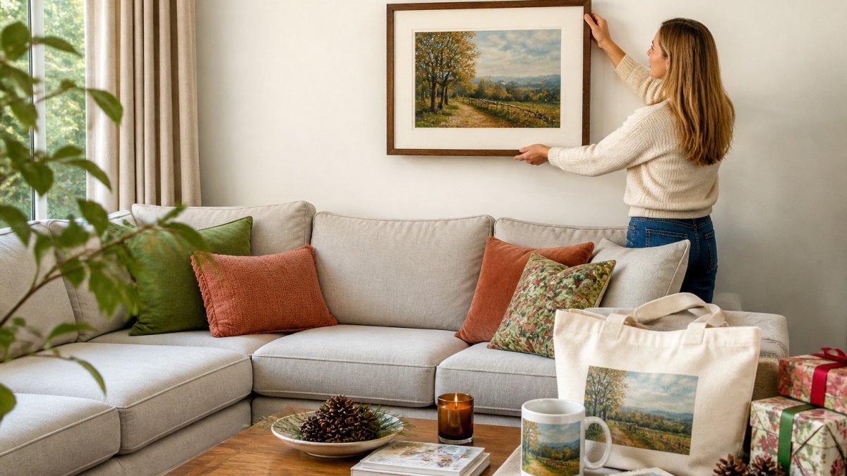
Here's a simple way to do it:
- Note your wall color. Is it warm (cream, beige, terracotta) or cool (gray, blue-gray, crisp white)?
- List your big furniture. Sofas and rugs take up the most visual space, so their colors matter most.
- Pick your accent colors. Throw pillows, vases, and books often carry the color you'll want to echo.
- Check the light. Morning sun and evening lamps change how colors look, so view the room at different times of day.
Once you have your list, hold a piece of art to the wall. Does it pull in one of your colors, or does it clash?
Watch out: Don't judge a color from a phone screen alone. Screens often shift blues and grays, so compare a printed sample against your actual wall in natural light.
A Repeatable Color-Matching Workflow
Step 1, Identify the dominant room colors. Stand at the doorway and squint.
Step 2, Choose an artwork palette. Pick analogous (neighbors on the color wheel), complementary (opposites), or neutral-plus-one-accent before you browse, so you're not swayed by trends.
Step 3, Test it in place. Tape a paint chip, a fabric swatch, or a printed color sample to the wall where the art will hang.
Step 4, Adjust once, not five times. If the sample feels too loud, drop one saturation level; if flat, add one contrasting accent. Then stop, over-tuning looks staged rather than lived-in.
Difficult Color Situations
Some rooms resist easy matching. How to handle the common ones:
- Patterned wallpaper. Don't try to match the pattern. Pull one quiet color out of the wallpaper and let the art repeat it. A busy floral wall wants calm, low-contrast art, not another pattern.
- A strong wall color. A deep teal or saturated terracotta wall already does the talking. Choose art with a neutral ground and one echo of the wall color, or go deliberately complementary for contrast.
- A multicolor rug. Treat the rug as your palette source. Pick the two colors in it you like best and choose art that uses those two, ignoring the rest.
Designers often solve a difficult room with contrast rather than match, a light piece on a dark wall, or a warm piece on a cool wall, because contrast reads as intentional, while a near-miss match reads as a mistake. When you're unsure how to match art colors in a tricky space, contrast is usually the safer call.
Check the Light Before You Commit
Lighting changes color more than most people expect. North-facing rooms lean cool and blue; south-facing rooms lean warm and golden. Warm bulbs push everything toward yellow-orange; daylight bulbs stay truer.
Before you buy, view the art in the room at the time of day you'll see it most. Shopping online, use a room photo to compare the art's dominant hues against your wall and furniture.
Pick a Palette: Analogous, Complementary, or Neutral
Most room color schemes fall into three simple approaches, each a clear starting point for choosing art.
Analogous colors sit side by side on the color wheel, like blue, blue-green, and green.
Complementary colors sit across from each other, like blue and orange or purple and yellow.
Neutral palettes rely on whites, grays, beiges, and blacks.
| Palette Type | Feels Like | Best Art Choice | Works Well In |
|---|---|---|---|
| Analogous | Calm, cohesive | Art with 2-3 related hues | Bedrooms, reading nooks |
| Complementary | Lively, bold | Art with one contrasting accent | Living rooms, entryways |
| Neutral | Clean, airy | Art with one strong color | Minimalist or open spaces |
Pick the approach that matches the mood you want.
Does Wall Art Have to Match Furniture?
No, coordination works better than matching. You want the colors to feel related, not identical.
Matching every shade can make a room look flat or staged. Look for one or two shared colors instead: a blue sofa and a painting with blue sky tones feel connected without looking copied.
The art should speak the same language as the room, even in a different tone.
Here's a quick check:
- Does the art share at least one color with the furniture or rug?
- Does it avoid clashing with the main wall color?
- Does it add something new, like a fresh accent or a calm break?
If you can answer yes to two of these, the piece will likely work well.
How to Add Color to a Neutral Room With Art
A neutral room can feel plain, but one well-chosen piece of art can change the whole space. Pick one strong color and repeat it lightly.
Choose the color you want to introduce, then place the art where your eye naturally lands, above a sofa or across from a window.
Follow these steps:
- Choose one accent color. Deep teal, warm rust, or muted gold all work well.
- Find art with that color as the main note. A landscape with a strong color mood is a great option.
- Repeat the color once or twice. Add a pillow, a vase, or a book cover in the same shade.
- Keep everything else quiet. Let the art do the talking.
Common mistake: Choosing a piece that's too small. In a neutral room, a small print can get lost.
How to Choose the Accent Color
In a neutral room almost any accent color will "work", which is why it's hard to choose. Narrow it down with three questions:
- What mood do you want? Cool accents (teal, navy, sage) read calm and restful; warm accents (rust, mustard, terracotta) read energetic and welcoming.
- What's already in the room? A wood floor, a leather chair, or a brass lamp already carries a warm undertone. Echoing it makes the accent feel native rather than added.
- What will you live with? A bold accent on the wall is easy to change; a bold accent repeated on a sofa or rug is a longer commitment. Start with the art and the small accessories.
Scale, Contrast, and Visual Weight
In a neutral room the art does the work of color, so size and contrast matter more than in a colorful room.
- Scale. A common guideline is that art should fill roughly two-thirds of the wall space above a sofa or console. In a neutral room, err larger rather than smaller, a small colorful print on a big blank wall reads as an accident, not a focal point.
- Contrast. High-contrast art (dark shapes on a light ground, or the reverse) holds a neutral wall better than low-contrast art, which can disappear from across the room.
- Visual weight. A single large piece carries more weight than a cluster of small ones. If you want a gallery wall, keep the frames consistent and let one piece carry the strongest color.
Add Color Without Repainting
You don't need to repaint to change the room. Art, textiles, and small objects can carry a color scheme on their own:
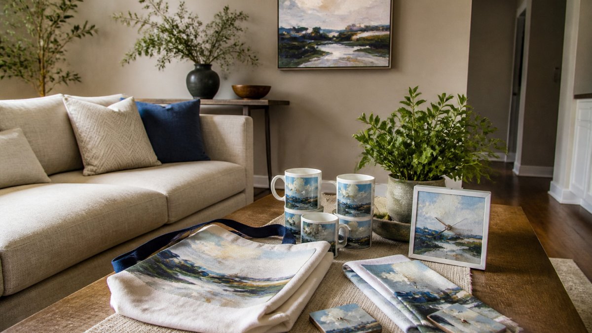
- Hang one large piece as the anchor, then echo its color in a throw, a cushion, or a ceramic vase.
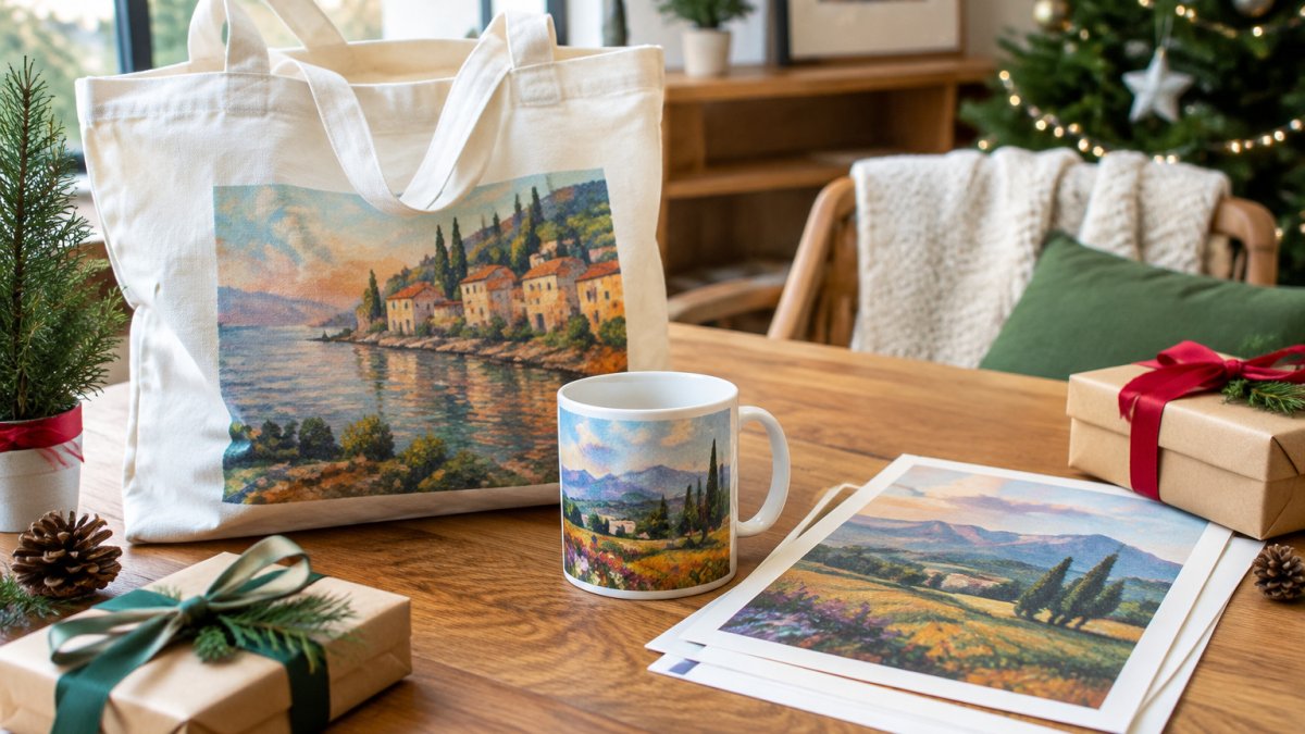
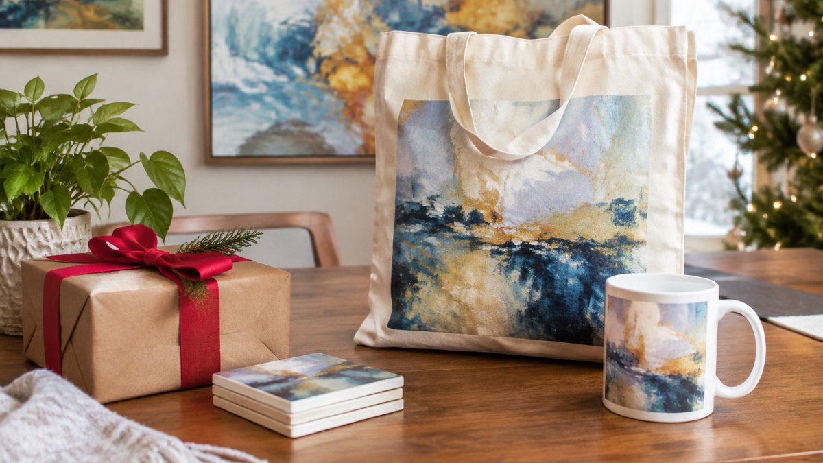
- Use a fine art print on a tote or mug to carry the same palette into a kitchen, hallway, or desk.
- Keep the frame neutral (black, white, or natural wood) so the color in the art, not the frame, does the talking.
A Budget-Friendly Holiday Angle
Neutral rooms are forgiving for gift shopping, since almost any accent color fits. For holiday gifts on a budget, a fine art print on a tote or mug in a single strong color makes a considered, personal gift that ties into a room's palette. Choose a palette you already love in your own home, and the gift will feel like it belongs, in a neutral apartment or a colorful house.
Choosing Artwork for a Room Color Scheme
Once you know your palette, narrow your choices with a few practical checks.
Start with size: art should fill roughly two-thirds of the wall space above a sofa or console, or it may feel lost.
Next, check the mood. Calm landscapes suit bedrooms.
Finally, test it in your space.
Lux Landscape Art offers an AR preview so you can check how a piece looks in your own room before committing.
How to Mix Art Styles in One Room
You can mix art styles, but you need a common thread. Without one, the wall can look scattered.
The easiest thread is color. Choose pieces that share a palette, even if one is a landscape and another is abstract. Keep frames consistent too. Matching frame tones, such as all black or all natural wood, tie different styles together.
Try this:
- Pick one dominant color that appears in every piece
- Use similar frame finishes across the group
- Keep the spacing even between pieces
Mixing styles works best when the pieces feel like they belong to the same story.
Bringing Your Matched Art Home: Gift and Decor Ideas Under Budget
Matching art doesn't have to mean spending a lot. Small, thoughtful pieces carry your color scheme into other parts of the home, and make good gifts too.
Fine art prints on tote bags, coffee mugs, and similar items bring a favorite landscape into daily routine.
These options work well for holiday shopping on a budget.
For a fuller view of how a piece might look in your home before you commit, the AR preview on Lux Landscape Art's site can help you test your color choices first.
Frequently Asked Questions
Does wall art have to match your furniture?
No, wall art does not need to match your furniture exactly. It works better when it shares one or two colors with the sofa, rug or curtains, so the eye sees a connection rather than a copy. A landscape with soft greens can echo a green throw pillow while contrasting with a gray sofa. Matching the undertone, warm or cool, usually matters more than matching the exact shade, and you can test options by holding a print next to the furniture before you hang it.
How can art add color to a neutral room?
In a room with white, beige or gray walls, a single piece with a clear color can become the focal point. Choose an artwork whose strongest color appears once or twice elsewhere in the room, such as in a cushion, a vase or a mug on the shelf. Repeating the color in small amounts ties the piece in without overwhelming the neutral base. Two or three smaller prints grouped together can add more color than one large piece if the wall feels bare.
How do you choose artwork colors for a room?
Start by listing the three to five dominant colors already in the room, including wall color, flooring and textiles. Then pick artwork that either uses one of those colors as its main tone or uses a color that sits next to it on the color wheel. Hold the print near the wall at different times of day, since natural and warm lamp light change how colors look. If the piece still feels off, step back and check whether it competes with the room's existing focal point.
Which holiday gifts let you share art colors on a budget?
Fine art prints printed on tote bags, mugs and similar everyday items are a way to give someone a piece of art they can use. Choose an image whose palette matches the recipient's kitchen, office or bedroom colors. Pricing depends on the item, quantity and delivery timing, so check Lux Landscape Art's website for current prices and options before you order.